Elegant Sans for High-end Branding
Styles


Deva Ideal typeface in use for the TV JOJ series Dr. Ema / Design: Jakub Jurášek / Directed by Barbora Kardošová, edited by Oliver Koniar.

Deva Ideal in use for the visual identity of the Slovak EU Presidency / Visual Identity: Jakub Dušička

Deva Ideal for the Slovak EU Presidency. Giant banner at Incheba, Bratislava / Visual Identity: Jakub Dušička

Deva Ideal typeface in use for the logo of Puojd textile design studio / Puojd.sk

Deva Ideal typeface in use for the logo of Puojd textile design studio / Puojd.sk

Deva Ideal typeface in use for the Slaninková visual identity and website / zapisniky.sk

Deva Ideal typeface in use for the film "Smutné rozkoše" (Sad Pleasures). / Production: Emedi Productions
Deva Ideal typeface in use for the film "Smutné rozkoše" (Sad Pleasures). / Production: Emedi Productions

Deva Ideal typeface in use for the "Osemdesiate" (The Eighties) exhibition at Slovak National Gallery. / Design: Matúš Lelovský, Juraj Blaško

Deva Ideal typeface in use for the Aliancia Fair Play (Fair Play Alliance), a Slovak civic watchdog organization

Deva Ideal in use for the visual identity of film distribution company Filmtopia / Design: Katarína Balážiková

Deva Ideal typeface in use for the book "Textilná tvorba a dizajn" (Textile Art and Design). / Book design: Katarína Balážiková
Deva Ideal typeface in use for the book "Textilná tvorba a dizajn" (Textile Art and Design). / Book design: Katarína Balážiková

Deva Ideal typeface in use for Považské múzeum v Žiline (Považie Museum in Žilina). / Design: Profigrafik
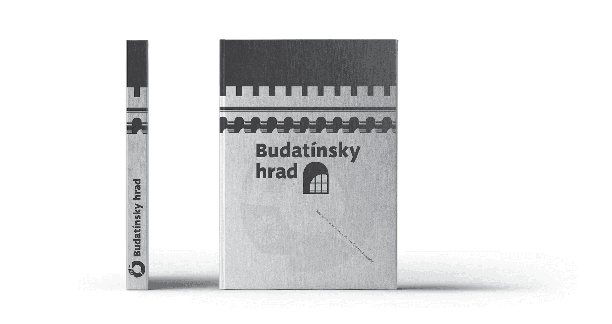
Deva Ideal typeface in use for the "Budatínsky hrad" (Budatín Castle) monograph. / Design: Profigrafik

Deva Ideal typeface for Kreativní Olomouc website

Deva Ideal typeface in use for the "Designer Critique" exhibition / Design: Katarína Balážiková

Deva Ideal featured in the visual identity and communication of Bratislava's cultural hub Foajé

Deva Ideal featured in the visual identity and communication of Bratislava's cultural hub Foajé

Deva Ideal typeface in use for the "Žena s ovocím" debut album by Marián Slávka & Andrej Hruška / Design: Tomáš Vrtich
Deva Ideal typeface in use for the TV JOJ series Dr. Ema / Design: Jakub Jurášek / Directed by Barbora Kardošová, edited by Oliver Koniar.
Deva Ideal in use for the visual identity of the Slovak EU Presidency / Visual Identity: Jakub Dušička
Deva Ideal for the Slovak EU Presidency. Giant banner at Incheba, Bratislava / Visual Identity: Jakub Dušička
Deva Ideal typeface in use for the logo of Puojd textile design studio / Puojd.sk
Deva Ideal typeface in use for the logo of Puojd textile design studio / Puojd.sk
Deva Ideal typeface in use for the Slaninková visual identity and website / zapisniky.sk
Deva Ideal typeface in use for the film "Smutné rozkoše" (Sad Pleasures). / Production: Emedi Productions
Deva Ideal typeface in use for the film "Smutné rozkoše" (Sad Pleasures). / Production: Emedi Productions
Deva Ideal typeface in use for the "Osemdesiate" (The Eighties) exhibition at Slovak National Gallery. / Design: Matúš Lelovský, Juraj Blaško
Deva Ideal typeface in use for the Aliancia Fair Play (Fair Play Alliance), a Slovak civic watchdog organization
Deva Ideal in use for the visual identity of film distribution company Filmtopia / Design: Katarína Balážiková
Deva Ideal typeface in use for the book "Textilná tvorba a dizajn" (Textile Art and Design). / Book design: Katarína Balážiková
Deva Ideal typeface in use for the book "Textilná tvorba a dizajn" (Textile Art and Design). / Book design: Katarína Balážiková
Deva Ideal typeface in use for Považské múzeum v Žiline (Považie Museum in Žilina). / Design: Profigrafik
Deva Ideal typeface in use for the "Budatínsky hrad" (Budatín Castle) monograph. / Design: Profigrafik
Deva Ideal typeface for Kreativní Olomouc website
Deva Ideal typeface in use for the "Designer Critique" exhibition / Design: Katarína Balážiková
Deva Ideal featured in the visual identity and communication of Bratislava's cultural hub Foajé
Deva Ideal featured in the visual identity and communication of Bratislava's cultural hub Foajé
Deva Ideal typeface in use for the "Žena s ovocím" debut album by Marián Slávka & Andrej Hruška / Design: Tomáš Vrtich
About Deva Ideal Typeface
Elegant Sans for High-end Branding
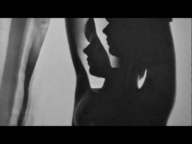
Deva Ideal was inspired by women’s beauty. It didn’t come only from the desire to create a new typeface. It also seeks to materialize beauty in a visual form. Instead of imitating the shapes of the female body or other formal attributes, Deva Ideal is an abstract expression of the women’s beauty.
The unique character of the typeface is achieved by the use of soft, almost invisibly bent strokes, since one of the priorities of the typeface is not to disturb the eye of the reader with odd design details. Deva Ideal excels in her cold beauty and shows her sex appeal. The soft curves present in Deva Ideal differ from the masculine and technical shapes used in most contemporary typefaces.
Deva Ideal has ideal proportions (90 / 60 / 90) and its shapes are essential and simple. Because of this, it is ideal for setting text in all kinds of printed matter: catalogues, books and magazines. The letter forms are wide and open, so text can be set in small sizes and thus space can be saved, while keeping the same degree of readability.
The author wishes to acknowledge František Štorm for his unvaluable opinions. Also to Palo Bálik and Peter Biľak for their contributions.
I am specially grateful to all the devas (archaic expression for beautiful young girl), who inspired me to design this typeface. This is dedicated to Janka Ráczová, Jarka Krajčiová, Mariana Felgueiras and obviously to Martinka Filípková! Every use of Deva Ideal is a little homage to these interesting women.
Elegant Sans for High-end Branding
Deva Ideal was inspired by women’s beauty. It didn’t come only from the desire to create a new typeface. It also seeks to materialize beauty in a visual form. Instead of imitating the shapes of the female body or other formal attributes, Deva Ideal is an abstract expression of the women’s beauty.
The unique character of the typeface is achieved by the use of soft, almost invisibly bent strokes, since one of the priorities of the typeface is not to disturb the eye of the reader with odd design details. Deva Ideal excels in her cold beauty and shows her sex appeal. The soft curves present in Deva Ideal differ from the masculine and technical shapes used in most contemporary typefaces.
Deva Ideal has ideal proportions (90 / 60 / 90) and its shapes are essential and simple. Because of this, it is ideal for setting text in all kinds of printed matter: catalogues, books and magazines. The letter forms are wide and open, so text can be set in small sizes and thus space can be saved, while keeping the same degree of readability.
The author wishes to acknowledge František Štorm for his unvaluable opinions. Also to Palo Bálik and Peter Biľak for their contributions.
I am specially grateful to all the devas (archaic expression for beautiful young girl), who inspired me to design this typeface. This is dedicated to Janka Ráczová, Jarka Krajčiová, Mariana Felgueiras and obviously to Martinka Filípková! Every use of Deva Ideal is a little homage to these interesting women.
Release Date
2007
Category
Sans-serif, Text
Weights
10 (5 Roman + 5 Italics)
OpenType Features
Ligatures, Discretionaly ligatures, Stylistic Alternates, All Caps, Small Caps, All Small Caps, Oldstyle Numbers, Lining Numbers, Tabular Lining Numbers, Tabular Oldstyle Numbers, Slashed Zero, Fractions, Ordinals, Subscript / Inferior, Superscript / Superior, Stylistic Set 1, Stylistic Set 2, Localized Forms
Language Support
Estonian, English, Swedish, Italian, Spanish, Catalan, Polish, Finnish, French, Slovak, German, Czech, Dutch, Afrikaans, Albanian, Basque, Breton, Norwegian (Bokmål), Indonesian, Latvian, Lithuanian, Slovene, Norwegian (Nynorsk), Portuguese, Hungarian, Sorbian, Kurdish (Latin), Hawaiian, Esperanto, Welsh, Faroese, Icelandic, Romanian, Luxemburgish, Romani, Turkish, Sámi (Inari), Sámi (Lule), Sámi (Southern), Friulian, Galician, Kashubian, Fijian, Ido, Sardinian, Scottish Gaelic