Multilingual Serif for Editorial Design
Styles


Preto Serif Typeface in use for the visual identity and app Readmio / Design: Erik Nota / Mockup: Magnific


Preto Serif Typeface in use as a secondary typeface for the visual identity of Modrá púpava (Blue Dandelion) / Design: Ivana Palečková

Readmio App / mockup by Magnific
Preto Serif Typeface in use as a secondary typeface for the visual identity of Modrá púpava (Blue Dandelion) / Design: Ivana Palečková

Preto Serif Typeface for a special edition of DenníkN newspaper / Design: Mish
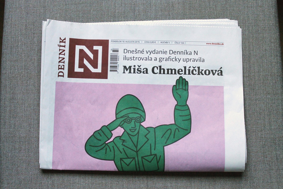
Preto Serif Typeface for a special edition of DenníkN newspaper / Design: Mish

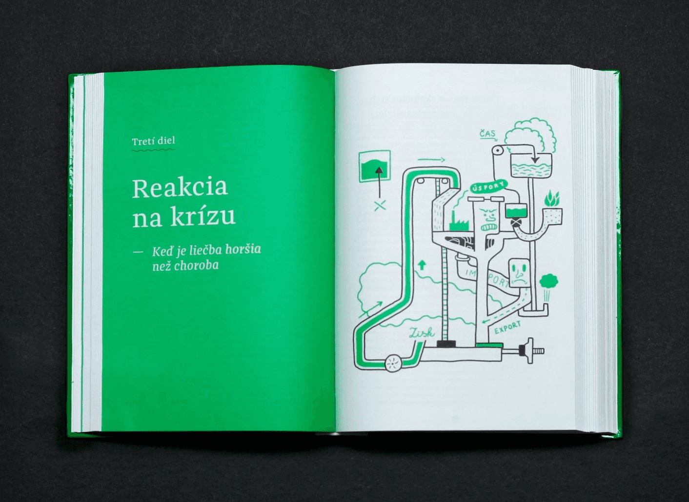
Preto Sans & Serif Typefaces in use for the visual identity for 150 years of the Bratislava City Museum (Múzeum mesta Bratislavy)

Preto Serif Typeface in use for the book Zlé peniaze (Bad Money) / Design: Matej Špánik
Preto Serif Typeface in use for the book Zlé peniaze (Bad Money) / Design: Matej Špánik

Preto Serif Typeface in use for the book Magia Nart (awarded as one of "The Most Beautiful Polish Books") / Design: Bartłomiej Witkowski
Preto Serif Typeface in use for the aha.slovakia book / Design: Tomáš Kompaník

Preto Serif Typeface in use for the various Preto Ryba Žilina fish salad packagings

Preto Serif and Sans Typefaces in use for "Sviňa" (The Pig) book

Preto typeface for Visual identity for Fest Anča International Animation Festival / Photo: Juraj Starovecky

Preto Serif Typeface in use for Laco Teren's exhibition "Nothing Can Stop Us!" at the Slovak National Gallery
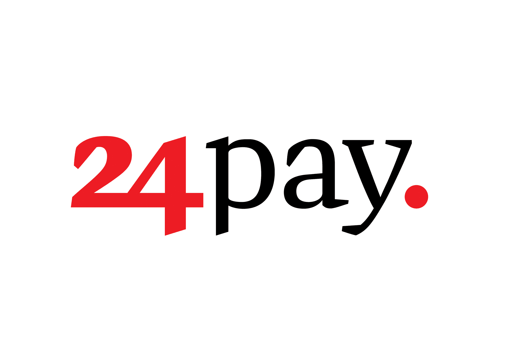
Preto Serif Typeface in use for the visual identity of 24pay paygate / Design: Marcel Benčík
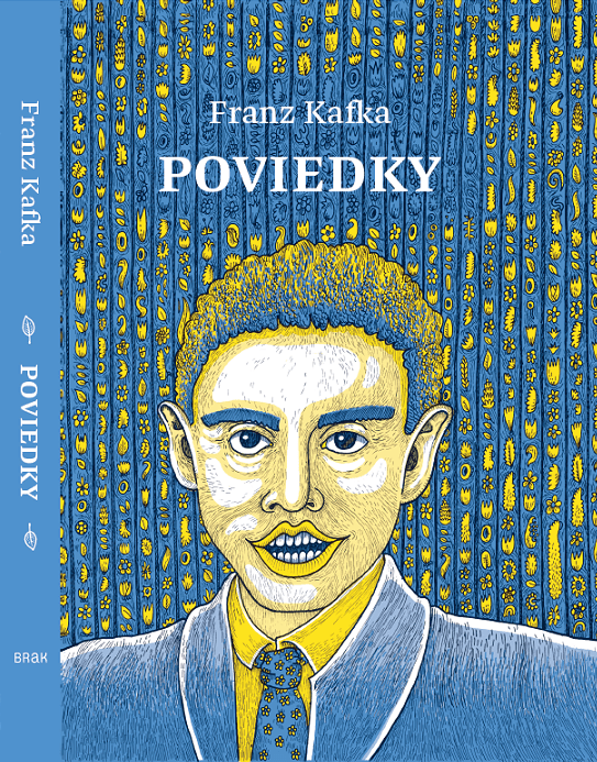
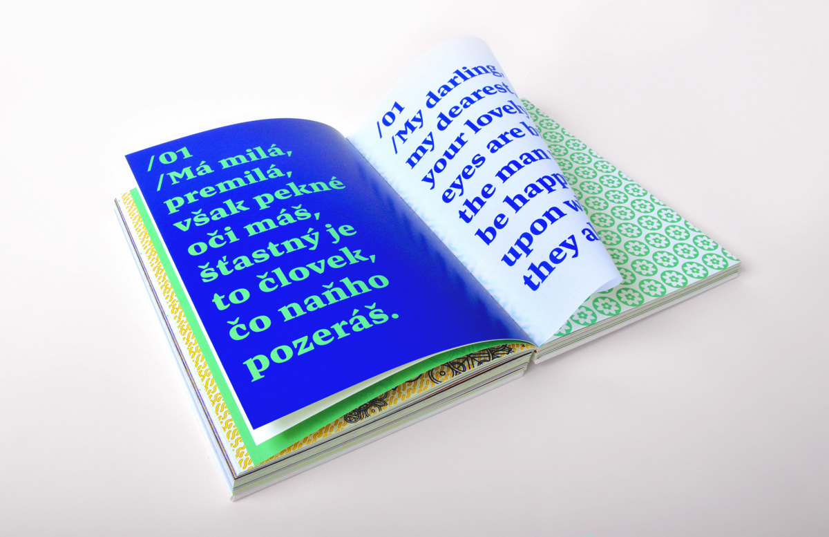
Preto Serif Typeface in use for "Poviedky" (Short Stories) by Franz Kafka / Illustration: Dávid Soboň

Preto Serif Typeface in use for "Odtlačky Gisi Fleischmannovej" (Imprints of Gisi Fleischmann) leaflet / Design: Martina Rozinajová
Preto Serif Typeface in use for the visual identity and app Readmio / Design: Erik Nota / Mockup: Magnific
Preto Serif Typeface in use as a secondary typeface for the visual identity of Modrá púpava (Blue Dandelion) / Design: Ivana Palečková
Readmio App / mockup by Magnific
Preto Serif Typeface in use as a secondary typeface for the visual identity of Modrá púpava (Blue Dandelion) / Design: Ivana Palečková
Preto Serif Typeface for a special edition of DenníkN newspaper / Design: Mish
Preto Serif Typeface for a special edition of DenníkN newspaper / Design: Mish
Preto Sans & Serif Typefaces in use for the visual identity for 150 years of the Bratislava City Museum (Múzeum mesta Bratislavy)
Preto Serif Typeface in use for the book Zlé peniaze (Bad Money) / Design: Matej Špánik
Preto Serif Typeface in use for the book Zlé peniaze (Bad Money) / Design: Matej Špánik
Preto Serif Typeface in use for the book Magia Nart (awarded as one of "The Most Beautiful Polish Books") / Design: Bartłomiej Witkowski
Preto Serif Typeface in use for the aha.slovakia book / Design: Tomáš Kompaník
Preto Serif Typeface in use for the various Preto Ryba Žilina fish salad packagings
Preto Serif and Sans Typefaces in use for "Sviňa" (The Pig) book
Preto typeface for Visual identity for Fest Anča International Animation Festival / Photo: Juraj Starovecky
Preto Serif Typeface in use for Laco Teren's exhibition "Nothing Can Stop Us!" at the Slovak National Gallery
Preto Serif Typeface in use for the visual identity of 24pay paygate / Design: Marcel Benčík
Preto Serif Typeface in use for "Poviedky" (Short Stories) by Franz Kafka / Illustration: Dávid Soboň
Preto Serif Typeface in use for "Odtlačky Gisi Fleischmannovej" (Imprints of Gisi Fleischmann) leaflet / Design: Martina Rozinajová
About Preto Serif Typeface
Multilingual Serif for Editorial Design
The serif version has been designed to work best at small point sizes (around 8, 9 points). You will not achieve calm, boring or invisible look of your text with Preto Serif. Its long, spiky and sharp serifs contribute to give the typeface a distinct and energetic character. It is very suitable for magazines, corporate identity, brochures or other print materials where a typeface for continuous reading is required.
The ligatures in Preto Serif are very special. You can set them in different tracking values and spacing will increase/decrease consistently in the ligatures as well. Alternative characters in the font files allow you to change the feeling of the text from typical to more special (J, Q, g , &). Each font contains a full set of small caps and many alternative characters for complex typesetting.
Preto Family
Preto is an extensive type family, which explores the function of serifs on readability and legibility. Preto consist of three subfamilies: Sans, Semi and Serif, which are designed for multilingual typesetting. All of the subfamilies have equal grey value in text sizes but different texture which can be use to differentiate languages. Preto subfamilies have two text weights and two bold styles (Regular > Bold, Medium > Black). Every weight has a companion Italic style which have big counter shapes and are ideal for setting the larger amount of text.
Update: (Preto is no longer available as two different packages – Preto and Preto OT Std. Preto OT Std is now called Preto and supports all alternative characters, different numbers, small capitals etc.)
Release Date
2013
Category
Serif, Text
Weights
8 (4 Roman + 4 Italics)
OpenType Features
Ligatures, Discretionaly ligatures, Stylistic Alternates, Contextual Alternates, All Caps, Small Caps, All Small Caps, Lining Numbers, Tabular Lining Numbers, Tabular Oldstyle Numbers, Slashed Zero, Fractions, Ordinals, Subscript / Inferior, Superscript / Superior, Stylistic Set 1, Stylistic Set 2, Stylistic Set 3, Stylistic Set 4, Localised forms
Language Support
Estonian, English, Swedish, Italian, Spanish, Catalan, Polish, Finnish, French, Slovak, German, Czech, Dutch, Afrikaans, Albanian, Basque, Breton, Norwegian (Bokmål), Indonesian, Latvian, Lithuanian, Slovene, Norwegian (Nynorsk), Portuguese, Hungarian, Sorbian, Kurdish (Latin), Hawaiian, Esperanto, Welsh, Faroese, Icelandic, Romanian, Luxemburgish, Romani, Turkish, Sámi (Inari), Sámi (Lule), Sámi (Southern), Friulian, Galician, Kashubian, Fijian, Ido, Sardinian, Scottish Gaelic