Fontstand Conference 2026 / EN
Fontstand Conference Report

I haven't been to a conference in a while. Ever since my real family (three small children) became my priority — and not just my typeface family (a joke for typographers, haha) — I rarely travel this far abroad. This time, however, it wasn't just a conference for me, but also an important business trip, as a Fontstand collaboration is taking shape that I want to be part of.
I met a lot of familiar faces there, including several renowned type designers, and also got to know many new colleagues. Yes, it's true that traveling costs money, but it pays back a hundredfold in the form of inspiration, networking, and often a complete reset and renewed energy.
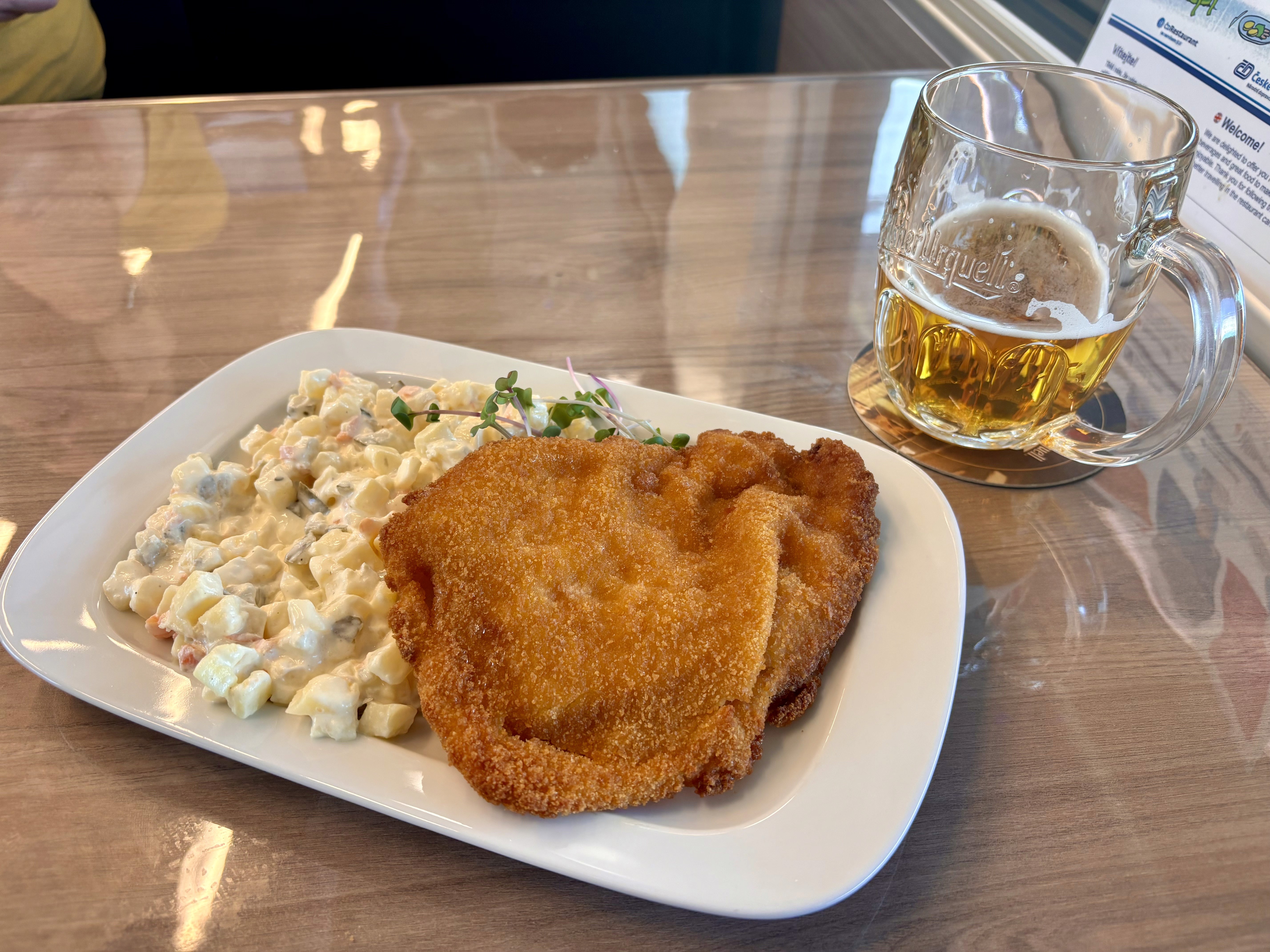
The first bonus came already on the train, traveling with Czech Railways. :)
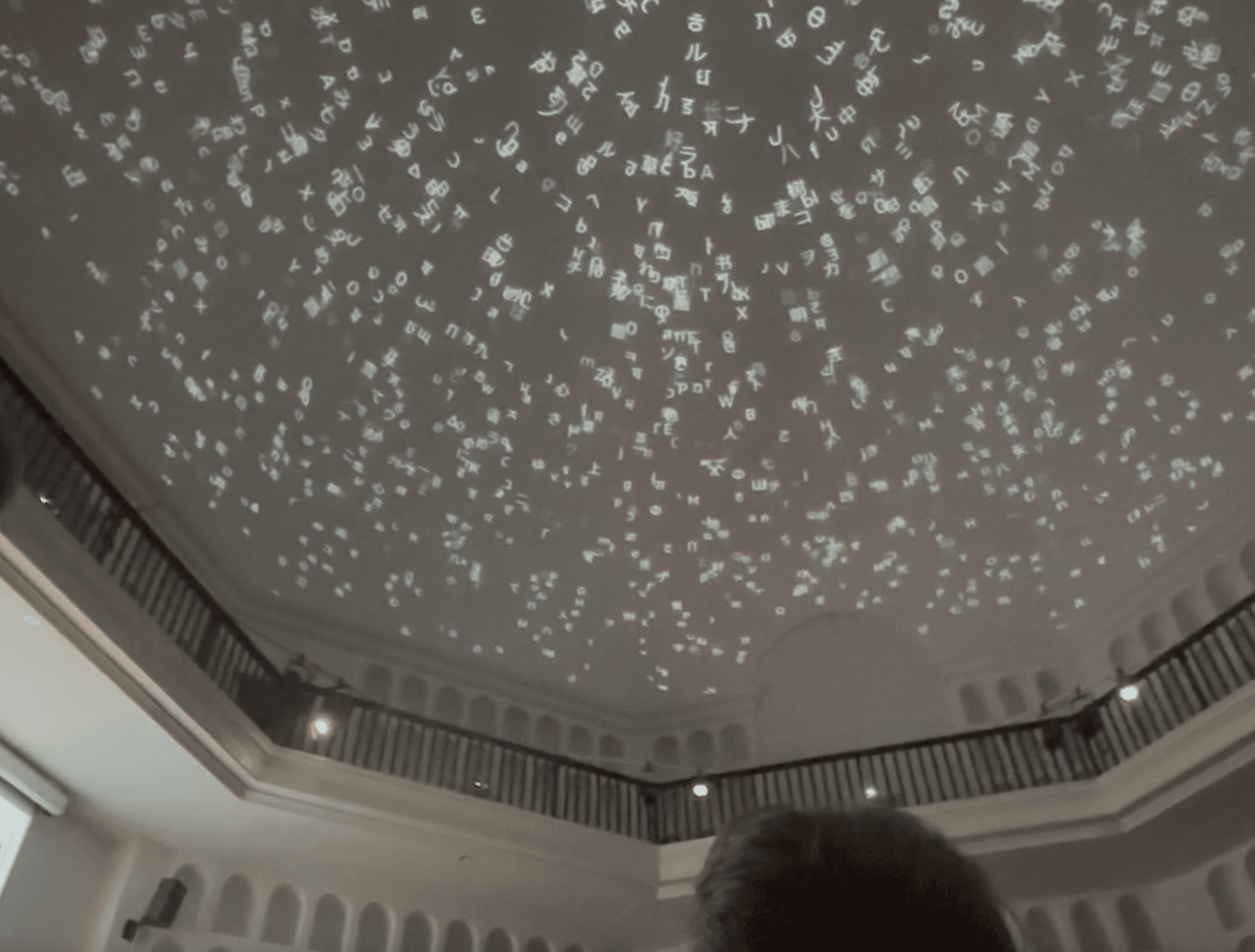
The conference kicked off with a strong visual moment — upon entering the hall, I was delighted by a "stellar" typographic sky. As far as I could tell, six projectors were used to project various typographic compositions onto the ceiling, created by Rafał Buchner from Typotheque.
We were welcomed right at the start by one of the conference organizers, Peter Biľak. If you don't know him, make sure to visit the Typotheque website. When I was starting out in type design, his typeface Fedra and the fact that he is Slovak were a huge inspiration for me. The second organizer, Andrej Krátky, handled the technical support. He sat quietly at the back as a "grey eminence." Together with Peter Biľak, they co-founded the innovative platform Fontstand. Also, check out the visual identity of the event, created by SetupType.
Talks
The selection of talks was very varied and inspiring. It was great to see and understand the work of diverse professionals from the typographic community. Here are just a few highlights:
Francesco Franchi
He spoke about the redesign of the Italian newspaper La Repubblica, which he redesigned twice over the course of three years. I was struck by the newspaper spreads, generously complemented with illustrations, charts, and photographs. They publish a different supplement each day of the week, so that different groups of readers find something for themselves. Truly inspiring visuals, the kind you don't often see in everyday newspapers.
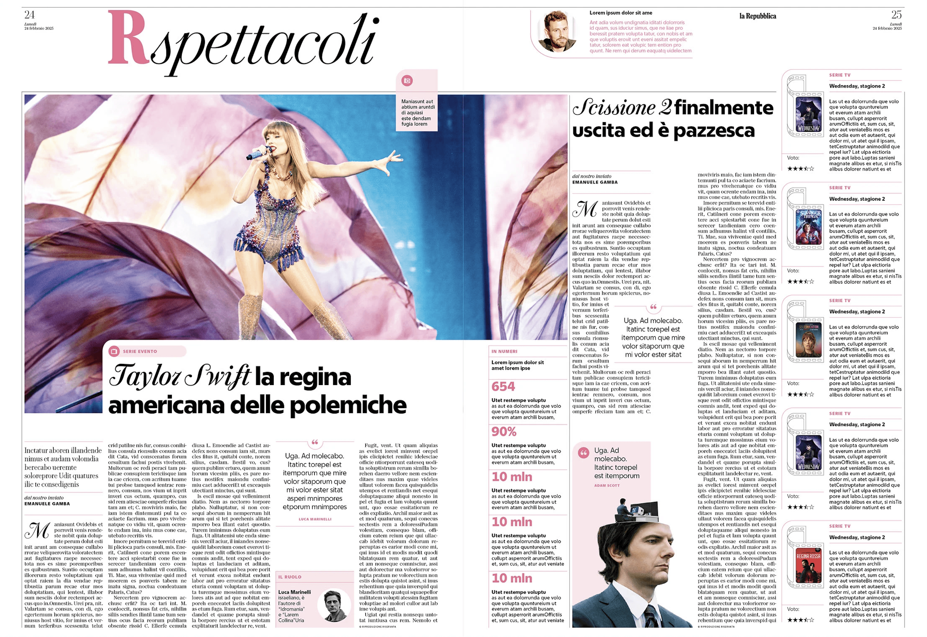
Source: Behance / Copyright (C) Manuel Bortoletti 2025
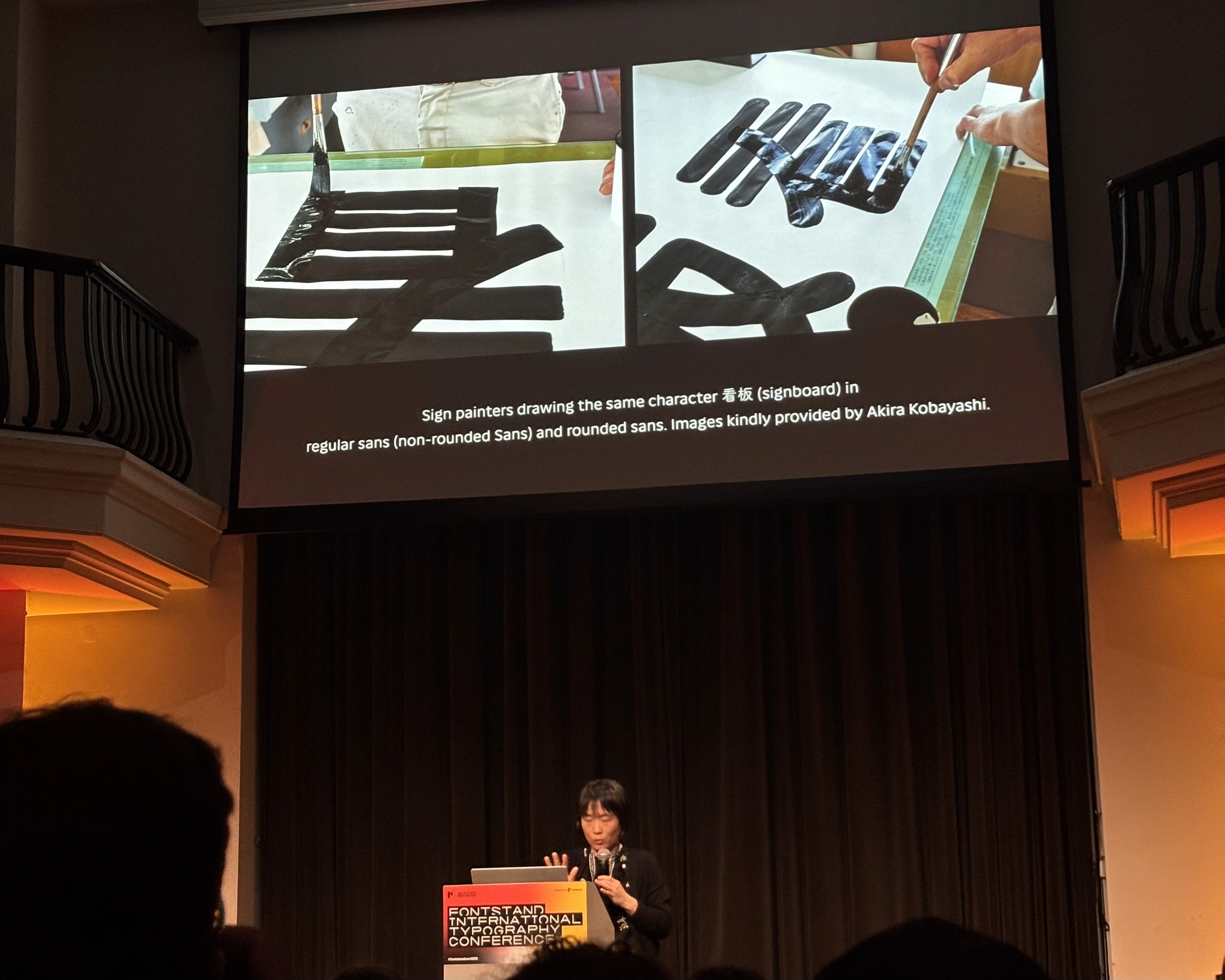
Shoko Mugikura
The co-founder of the studio Just Another Foundry (also known for the RMX tool — an excellent aid for type designers) reflected on why she is fascinated by rounded sans-serif typefaces. She discovered that the Japanese are unique in having a tradition of using rounded letterforms in public spaces — you won't encounter this to the same extent anywhere else in the world. It stems from history: the Japanese commonly combine three different writing systems in a single inscription. To unify them visually, sign painters in the past wrote characters with rounded strokes. It was not only an aesthetic choice but also a practical one, as rounded forms were faster to paint.
Marko Hrastovec
He showed that the International Style in the 1950s was not exclusive to Switzerland, but was part of a modernist wave that was also popular in the former Yugoslavia. I think a similar parallel could be found in former Czechoslovakia, something that the Slovak Design Museum maps excellently.
Ferdinand Ulrich
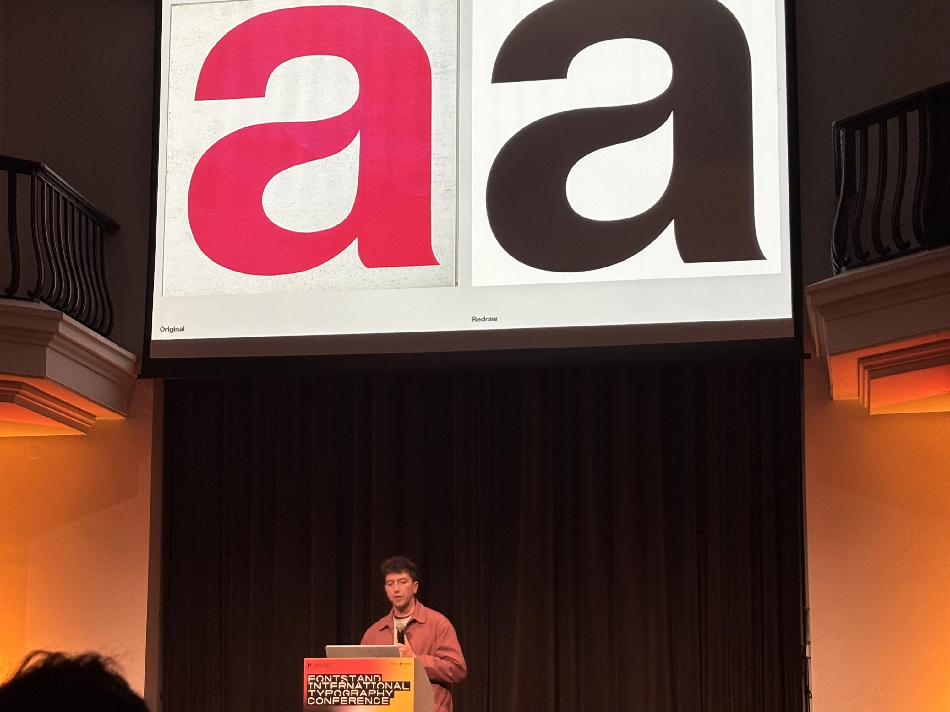
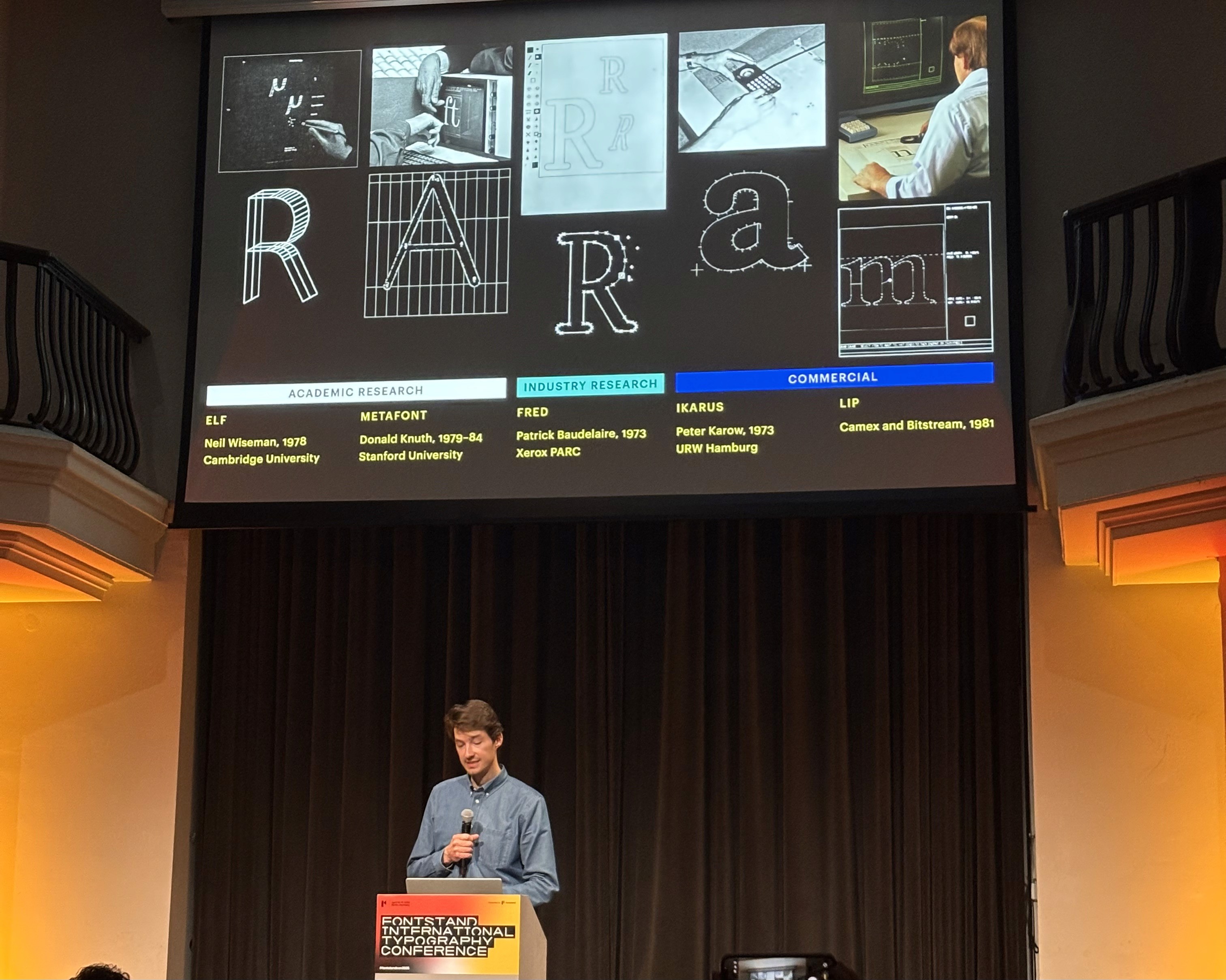
For nearly ten years now, he has been researching digital technologies from the era before the .otf format. It is fascinating and today almost unimaginable how designers managed to create fonts without a monitor — by manually scanning individual points that form the shape of a letter, for example using the Ikarus system.
Martin Wenzel
He spoke about a typeface designed for the German federal government. He described the journey to winning the competition, as well as how the custom font saved the government big money in licensing fees. The old fonts on government websites were recently replaced with webfonts and the hinting was updated, which reduced the size of downloaded data. Given the enormous traffic, this is an important ecological and sustainable step.
Ariane Spanier
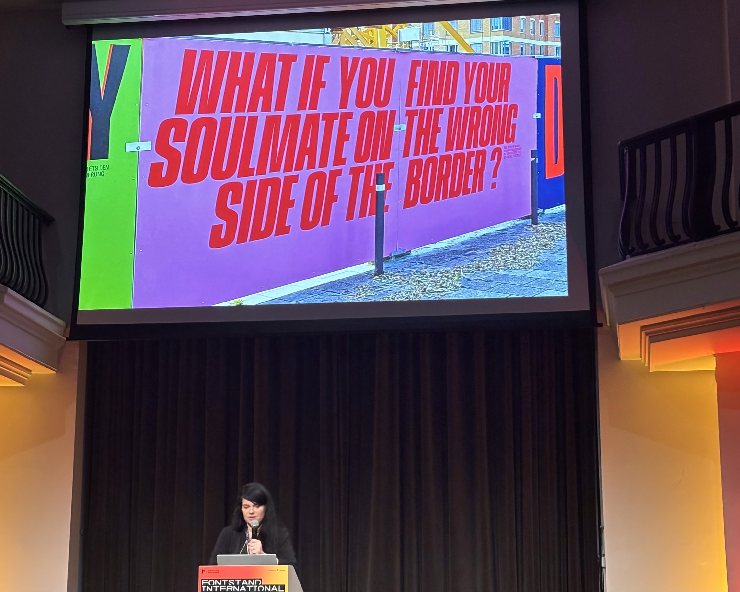
Among other things, she talked about creating stop-motion animations for Vice — in one of them, her two cats lick a sign made from milk. I was particularly taken by her public space project called "Borders." It is a 350-meter-long fence around a future museum being built in a former border zone where the Berlin Wall once stood. The installation uses quotes responding to the theme of political and personal borders.
Side activities
The conference was accompanied by several workshops — for example, the Berlin Lettering Walk. Imagine a group of enthusiasts photographing a faded inscription on a building facade with the same excitement as teenagers spotting their favorite celebrity.
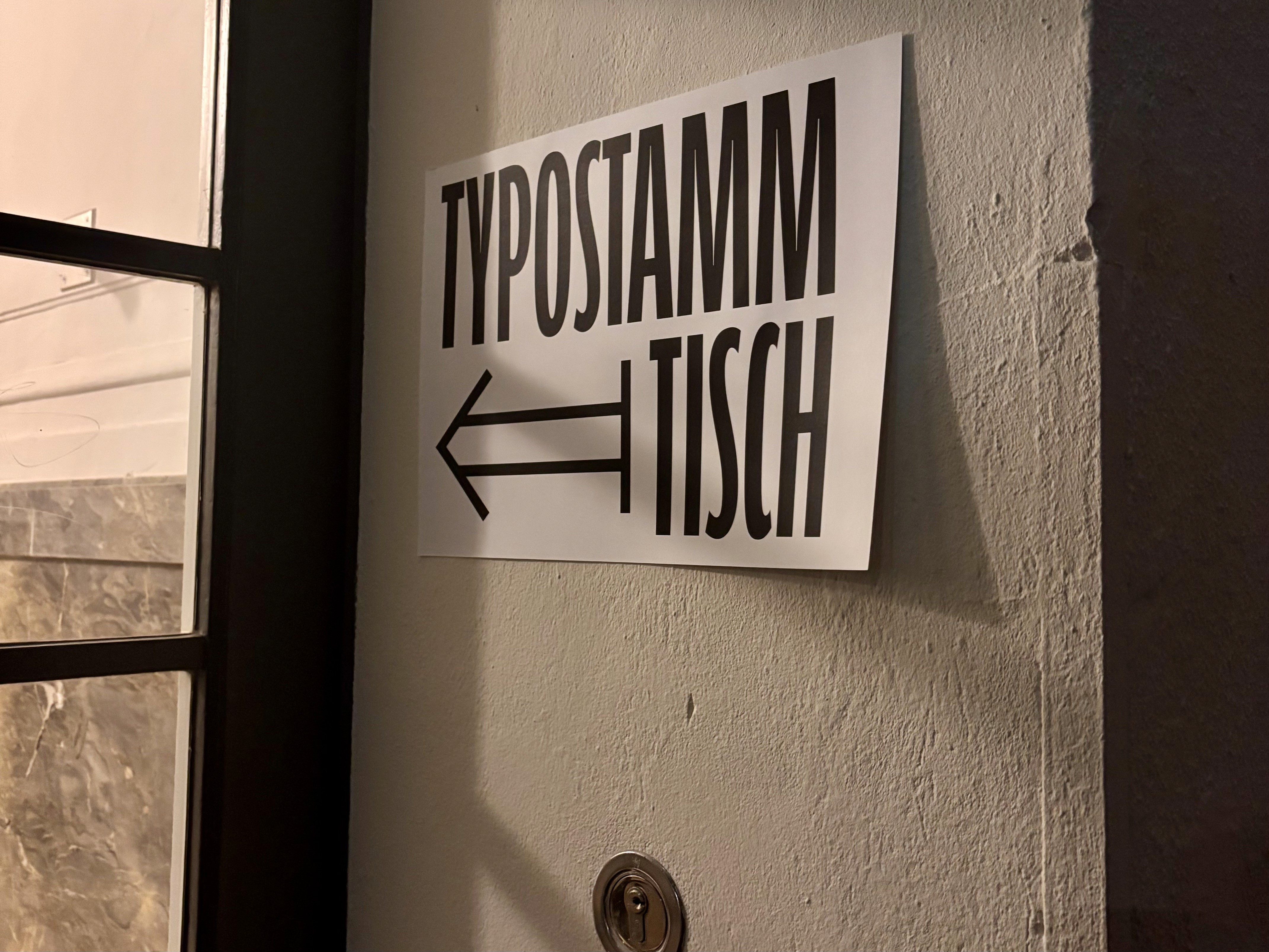
I was also drawn to an activity called "Typostammtisch" (from the German Stammtisch — a regulars' table), hosted by Lucas de Groot at his studio. These are informal gatherings where designers (often over a beer) talk about their projects. It reminded me that we could revive our Bratislava "Typo Pivo (Type beer)“.
Finally, I want to share a few inspirations I came across thanks to my Slovak friends at klike.studio, who live in Berlin. The cherry on top was discovering that the two of them, twenty years ago through the Leonardo da Vinci programme (now Erasmus+), did an internship at the studio Moniteurs, where they collaborated on the information system for Berlin Airport. The founders of Moniteurs — a world leader in wayfinding systems and airport typography — gave a fantastic talk at the conference.
See you at the Fontstand Conference 2027? It will be in The Hague, Netherlands. ;)
Berlin Typo Inspiration with klike.studio


